Table of Contents
ToggleThe Best Call-to-Action (CTA) Optimization Guide: A Complete 3000-Word Strategy to Maximize Conversions
Your marketing funnel can have:
-
Great traffic
-
Strong ad copy
-
Beautiful design
-
Valuable content
But if your Call-to-Action (CTA) is weak, unclear, or poorly placed — conversions will suffer.
CTA optimization is one of the highest ROI improvements you can make in digital marketing. A small change like switching from “Submit” to “Get My Free Guide” can increase conversions by 10–40%.
Whether you’re optimizing CTAs on landing pages, email campaigns, or ads running on Google, Facebook, Instagram, YouTube, or LinkedIn, this complete guide will help you craft high-converting CTAs.
We’ll cover:
-
What makes a CTA powerful
-
Psychological triggers behind action
-
CTA copywriting formulas
-
Design optimization tips
-
Placement strategy
-
Mobile CTA best practices
-
Testing & data analysis
-
Advanced optimization techniques
Let’s dive in.
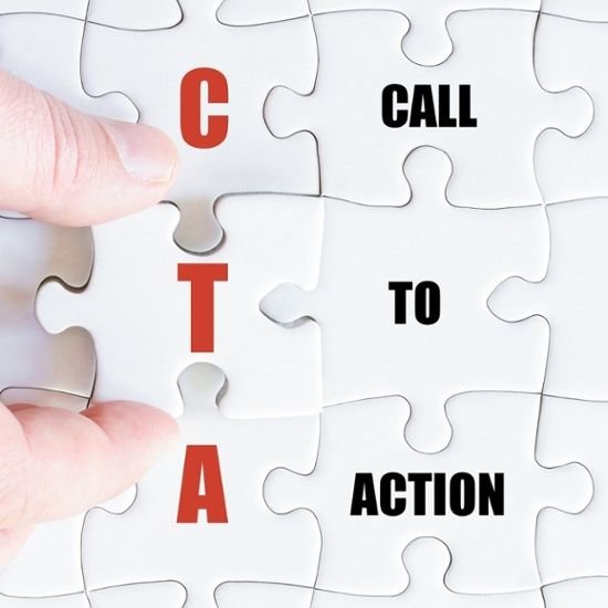
1. What Is a Call-to-Action (CTA)?
A CTA is a prompt that tells users what to do next.
Examples:
-
Buy Now
-
Download Free Guide
-
Book a Call
-
Start Free Trial
-
Subscribe Today
It is the final push that converts interest into action.
Without a strong CTA, your marketing is incomplete.
2. Why CTA Optimization Matters
A high-performing CTA:
-
Improves conversion rate
-
Reduces cost per acquisition
-
Increases sales
-
Boosts ROI
-
Enhances user experience
Even if you don’t increase traffic, better CTA performance increases results.
Conversion rate optimization (CRO) often starts with CTA improvements.
3. The Psychology Behind High-Converting CTAs
People take action when they feel:
-
Clarity
-
Urgency
-
Trust
-
Personal relevance
-
Low risk
-
High value
A great CTA reduces friction and increases motivation.
4. The Golden Rules of CTA Copy
Rule 1: Be Specific
Weak:
Submit
Strong:
Get My Free SEO Checklist
Specific CTAs convert better because they clarify benefit.
Rule 2: Use First-Person Language
Example:
Instead of:
Get Your Free Guide
Test:
Get My Free Guide
First-person language often increases conversions by making the action feel personal.
Rule 3: Highlight Value
Always include the benefit.
Bad:
Click Here
Better:
Download the Free Blueprint
Best:
Download My 10-Step Growth Blueprint
Value clarity drives clicks.
5. 12 High-Converting CTA Formulas
Here are proven structures:
-
Get My [Benefit]
-
Start My Free [Offer]
-
Claim Your [Bonus]
-
Unlock Instant Access
-
Book My Free Strategy Call
-
Try It Risk-Free
-
Yes, I Want Results
-
Save My Spot
-
Show Me How
-
Start Saving Today
-
Upgrade My Plan
-
Join 5,000+ Members
These formulas work across landing pages and ad campaigns.
6. CTA Optimization for Landing Pages
Landing pages must guide users toward one primary action.
A. One Clear CTA
Avoid multiple competing actions.
If your goal is:
Lead generation → One CTA
Sales → One CTA
Too many buttons reduce clarity.
B. Above the Fold Placement
Your CTA should appear:
-
Immediately visible
-
After benefits section
-
After testimonials
-
At page bottom
Repetition improves conversion.
C. Use Action-Oriented Language
Strong verbs:
-
Get
-
Start
-
Claim
-
Discover
-
Unlock
-
Download
-
Book
Action words increase engagement.
7. CTA Design Optimization
Copy matters — but design also impacts performance.
A. Button Color Contrast
CTA button should:
-
Contrast with background
-
Stand out visually
-
Be easily noticeable
High contrast improves clickability.
B. Button Size
Too small = invisible
Too large = overwhelming
Balance is key.
C. White Space
Give your CTA room to breathe.
Crowded layouts reduce focus.
8. CTA Optimization for Ads
On platforms like Facebook and Instagram:
Use both:
-
Platform CTA button
-
CTA inside ad copy
Example:
Copy:
Ready to scale your business?
Book your free strategy call today.
Button:
Book Now
Double reinforcement increases action.
9. CTA Optimization for Google Ads
On Google:
Use:
-
Strong headline CTA
-
Callout extensions
-
Structured snippets
Example:
Headline:
Get Free Website Audit Today
Description:
Limited-time offer. Book your audit now.
Search intent + urgency improves CTR.
10. CTA Optimization for Email Marketing
Emails should focus on one main CTA.
Tips:
-
Use buttons instead of text links
-
Place CTA above the fold
-
Repeat at bottom
-
Keep copy concise
Example:
Subject:
Your Free Guide Is Inside
Button:
Download My Guide
11. Urgency & Scarcity in CTAs
Urgency increases action.
Examples:
-
Claim Offer Before Midnight
-
Limited Spots Available
-
Offer Ends Today
-
Only 10 Seats Left
But avoid fake urgency — trust is long-term.
12. Risk Reversal in CTAs
Reduce fear with guarantees.
Examples:
-
Start Risk-Free
-
30-Day Money-Back Guarantee
-
Cancel Anytime
-
No Credit Card Required
Lower risk = higher conversions.
13. Mobile CTA Optimization
Over 60% of traffic is mobile.
Optimize by:
-
Sticky bottom CTA button
-
Large tap-friendly buttons
-
Short text
-
Clear visibility
Avoid tiny buttons.
Mobile clarity is critical.
14. Microcopy Optimization
Small text near CTA can increase conversions.
Examples:
-
No spam. Unsubscribe anytime.
-
Takes less than 60 seconds.
-
Free forever plan available.
Microcopy reduces hesitation.
15. A/B Testing Your CTAs
Never assume the first version is best.
Test:
-
First-person vs second-person
-
Color variations
-
Short vs long text
-
Urgency vs neutral
-
With guarantee vs without
Small tests can lead to big improvements.
16. Data to Track for CTA Optimization
Track:
-
Click-through rate
-
Conversion rate
-
Scroll depth
-
Heatmaps
-
Bounce rate
-
Form completion rate
Tools like heatmaps show where users hesitate.
Data-driven optimization beats guesswork.
17. Advanced CTA Strategies
A. Dynamic CTAs
Change CTA based on user behavior.
New visitor:
Download Free Guide
Returning visitor:
Start Your Free Trial
Personalization increases relevance.
B. Multi-Step CTAs
Instead of:
Long form on one page
Use:
Step 1: Enter email
Step 2: Complete details
Micro-commitments improve conversion.
C. CTA Anchoring
Place CTA after high-value sections:
-
Testimonials
-
Case studies
-
Statistics
-
Benefits
Emotional peak = best time to ask.
18. Common CTA Mistakes
-
Generic wording
-
Too many CTAs
-
Poor contrast
-
Weak value proposition
-
No urgency
-
Long confusing text
-
Hidden buttons
Fixing these alone improves performance.
19. 30-Day CTA Optimization Plan
Week 1:
-
Audit all CTAs
-
Identify weak language
Week 2:
-
Rewrite with benefit-focused copy
-
Improve button design
Week 3:
-
Add urgency & risk reversal
-
Optimize mobile experience
Week 4:
-
A/B test variations
-
Scale winning versions
Optimization is ongoing.
20. CTA Examples for Different Industries
eCommerce
Add to Cart
Buy Now & Save 20%
SaaS
Start Free Trial
Get Instant Access
Coaching
Book My Free Call
Apply for Mentorship
Local Business
Get Free Quote
Call Now
Online Courses
Enroll Today
Reserve My Seat
Always align CTA with business goal.
Final Thoughts: A Great CTA Turns Attention into Revenue
Your CTA is not just a button.
It is:
-
The decision trigger
-
The conversion point
-
The bridge between interest and action
The best CTAs:
-
Are clear
-
Are benefit-driven
-
Reduce risk
-
Create urgency
-
Stand out visually
-
Are tested consistently
If you focus on improving your CTAs across:
-
Landing pages
-
Ads
-
Emails
-
Sales funnels
You will see measurable increases in conversion rate and revenue — without increasing traffic.
Small words.
Big impact.